Are you lost in the vast sea of data visualization tools, unsure which one will steer your organization toward success?
Many software buyers like yourself face the daunting task of choosing the right BI software from a sea of options with similar features. We have the solution.
Our article explores the top visual analytics tools, empowering you to compare what’s out there and make an informed decision.
Compare Data Visualization Leaders
Article Roadmap
Modern visual analysis platforms transform your complex BI into stunning visuals. They’re helpful when you’re pressed for time and have only a minute to glance at the data, especially during ad hoc reporting.
With self-service BI, data visualization software provides interactivity with simple user actions, tooltips, popups, click-and-select options and customizable templates for reports and dashboards.
Many tools pull the latest data in real time for data visualization.
But every tool doesn’t support all features, and understanding the tradeoffs will give you a better idea of which features matter to you.
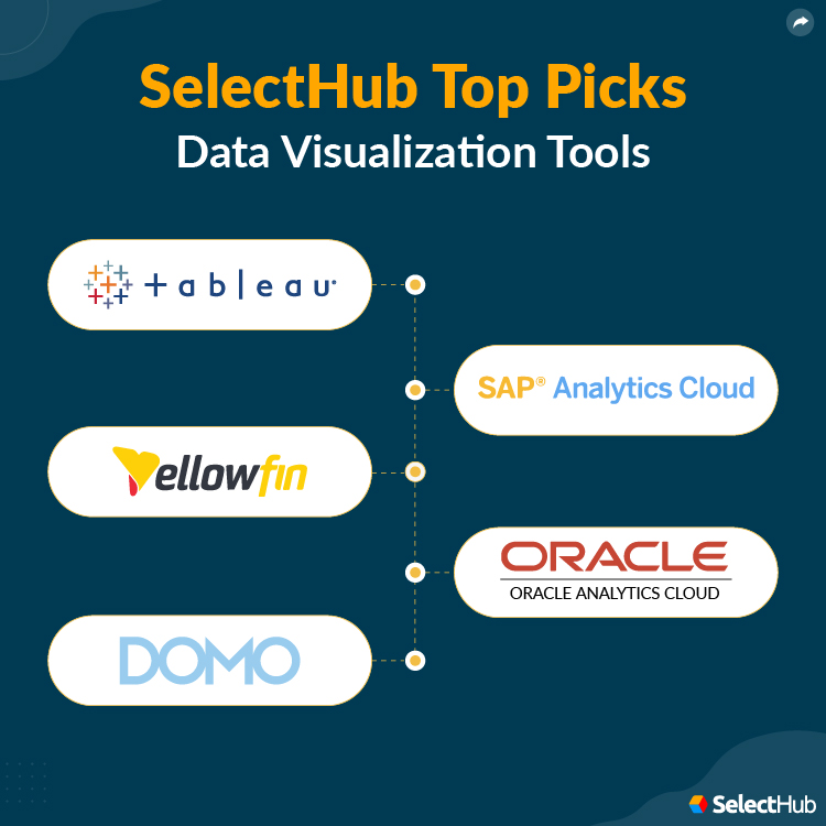
Best Data Visualization Tools
Our analysts curated a list of the best data visualization software to give you an idea of what to expect.

Tableau
It’s a popular BI visualization tool with interactive, intuitive and embeddable dashboards. Its strength lies in processing vast data volumes. Thanks to the vendor’s dedicated module, Tableau Prep, you can manage data pipelines end to end.
Choose from several visualization types, including waterfall, bump and small multiple charts. Or build treemaps, histograms, box plots, Gantt charts and word clouds. D3 integrations extend the platform’s functionality by providing additional graphics.

Understand customer satisfaction metrics with visualizations. Source
Highest Rated Modules According to Our Data
- Dashboarding and Data Visualization — 100
- Data Management — 100
- Geospatial Visualizations and Analysis — 100
- Data Querying — 99
- Reporting — 93
Top Benefits
- Boost Revenue: Perform fast analytics — track revenue, costs, conversions and leads instead of spending time organizing the data. Find inefficiencies and create impactful strategies with the latest market intelligence.
- Democratize Data: Gain insights with help from guided automated workflows, thanks to machine learning (ML). Highlight critical data sets to share your impressions and opinions about the data on display.
- Keep Data Secure: Restrict access to authorized users with row-level access and permissions management. The vendor complies with SOC security protocols and is a certified participant in the EU-U.S. Privacy Shield framework.
- Stay Connected 24/7: Interact with your data when away from the office with Tableau’s mobile app, available on Android and iOS. Offline mode is available.
Primary Features
- Live and In-Memory Data: Connect to sources in real-time and pull live data, irrespective of the volume. Or use the data cached in memory for low-volume, complex visualizations with large data sets.
- Data Connectors: Draw data using built-in connectors for many popular sources. You can build custom connectors for your preferred sources, but Tableau offers limited support.
- Geospatial Visualizations: Tableau fully supports geographic searches, geospatial functions, spatial files and mapping services integrations. You can convert an address to location coordinates and vice-versa.
- Tableau AI: Ask a question in plain text to get answers to your data queries with this visualization tool. Tableau provides generative AI with Einstein Analytics, the intelligent platform that drives smart products for Salesforce.
Limitations
- Doesn’t provide column or cell-level security.
Features Not Fully Supported According to Our Data
- PMML — Not Supported
- Voice Searches — Not Supported
- Secure Writebacks — Supported With Custom Development
- Streaming Analytics — Supported With Partner Integrations
- Auto-Generated Forecasts — Not Supported
Platform:
Company Size Suitability: S M L
SAP Analytics Cloud
SAP’s data visualization software for planning, BI and predictive analytics with ML-driven data preparation and ready-to-go data models, dashboards and stories. It can automatically generate charts, maps and graphs once you input the desired data.
You can build apps and drive transactions and strategy with SAP Integrated Business Planning for Supply Chain, SAP S/4HANA and SAP SuccessFactors platforms.
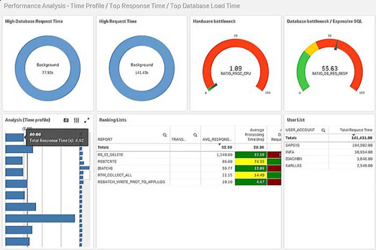
A Performance Analysis Dashboard in SAP Analytics. Source
Highest Rated Modules According to Our Data
- Data Management — 100
- Dashboarding and Data Visualization — 99
- Reporting — 93
- Advanced Analytics — 88
- Data Querying — 88
Top Benefits
- Maximize Returns: Become more efficient and collaborate better using AI for data discovery and search recommendations. Detect risks ahead of time and make informed decisions.
- Leverage AI for Analytics: Scale data preparation and model building, regardless of the volume. The solution uses machine learning to select features and algorithms for classification.
- Develop Applications: Build apps for BI using no/low-code actions, reusable widgets, modular APIs and open connectors.
- Integrate With SAP S/4 HANA: Track real-time data and gain instant, contextual insights. Make informed decisions, pivot with the market and create comprehensive plans with access to the complete business picture.
Primary Features
- Acquire Embedded Insights: Give the power of insight in the hands of your users by embedding dashboards and visualizations into third-party applications, provided the data resides in SAP S/4 HANA.
- Stories: Convert your vision into visuals — give your presentation a professional look by choosing from several interactive graphics. Personalize stories with custom widgets, filters and bookmarks.
- Calendar: Its built-in calendar lets you assign and schedule tasks, set and track task status and reminders, and view their due dates.
- Role-Based Access Control: The vendor allows setting user and team-based access restrictions and assigning individual workspaces for users via separate folders.
Limitations
- Doesn’t support auto-generated forecasts.
- Doesn’t support voice searches.
Features Not Fully Supported According to Our Data
- Sentiment Analysis — Supported With Partner Integrations
- Text Mining — Supported With Partner Integrations
- Automated Anomaly Alerting — Not Supported
- Dashboard Rebranding — Moderately Supported Out of the Box
- Complex Queries — Moderately Supported Out of the Box
Platform:
Company Size Suitability: S M L
Yellowfin BI
It’s a BI visualization tool with pre-built dashboard templates, graphics and robust APIs. You can build three kinds of apps — data apps, point-in-time stories and narratives of evolving events, or dynamic stories.
The solution draws data from relational databases, Hadoop, NoSQL, spreadsheets and web sources. Gain quick answers to data queries with assisted insights. Optimize resources by generating dummy data previews for longer reports.

A revenue analysis dashboard in Yellowfin BI.
Highest Rated Modules According to Our Data
- Data Management — 100
- Data Querying — 97
- Dashboarding and Data Visualization — 96
- Reporting — 93
- Embedded Analytics — 88
Top Benefits
- Accelerate Analytics: Automate data analysis and get plain text summaries of the displayed metrics. Input data and define its context in the Insight Wizard to generate charts automatically.
- Gain Embedded Insights: Embed dashboards and visualizations into web pages and host applications. You can import and embed reports from Tableau and Qlik Sense.
- Reduce Time to Insight: Convey the message clearly — enhance your presentations with data stories that include reports, images and animated charts.
Primary Features
- Extended Dashboard Functionality: Customize dashboards with widgets, action buttons and low/no-code functionality with HTML, CSS and JavaScript.
- Automated Business Monitoring: Track data sets consistently and alert users about them with Yellowfin Signals. Monitor how data changes over periods with time-series analysis.
- Brushing Tool: Spot trends and identify associations — highlight selected data sets and watch as they light up in every visualization or data table.
- Broadcasting: Send reports as email attachments in PDF, HTML and CSV formats or schedule them for later.
Limitations
- Doesn’t allow changing the hierarchies and data types inherited from the OLAP cube.
- Doesn’t support financial planning and profit analysis.
Features Not Fully Supported According to Our Data
- Augmented Data Preparation — Not Supported
- Automated Algorithm Selection and Model Tuning — Not Supported
- PMML — Supported With Partner Integrations
- Batch Updates — Moderately Supported Out of the Box
- Geospatial Functions and Calculations — Not Supported
Platform:
Company Size Suitability: S M L
Oracle Analytics Cloud (OAC)
It’s a cloud solution for collaborative analytics that provides data access from anywhere with availability on mobile devices. Get personalized insights with voice searches on the server and mobile app, thanks to natural language processing and speech recognition.
Deploy on the Oracle Cloud Infrastructure (OCI), or host a server instance and deploy it to your preferred data center or cloud system like Microsoft Azure. The solution works with Microsoft Azure, Google Cloud Platform and AWS.

A workforce management dashboard in Oracle Analytics. Source
Highest Rated Modules According to Our Data
- Dashboarding and Data Visualization — 97
- Data Management — 95
- Reporting — 93
- Mobile BI — 90
- Advanced Analytics — 89
Top Benefits
- Acquire Comprehensive Insights: Leave no data behind — establish secure connections to public and private clouds and on-premises systems, including databases. The vendor offers over 35 connectors out of the box.
- Democratize Insights: Visual stories, automated search and visualization recommendations, custom visuals, and geospatial analysis allow users to interact with data and find answers quickly.
- Control Data Quality: Manage reports centrally as an administrator — restrict access to certified sources and approved metrics and authorize report printing and sharing.
- Analyze Data Independently: Perform low-code querying with visual analytics, thanks to machine learning and plain-text searches. Explore data as desired with interactive visualizations and a click-and-drag interface.
Primary Features
- Custom Graphics: Use pre-built graphics with this visualization tool, or extend your options using Oracle’s extension library or D3 graphics from GitHub.
- Composite Visualizations: Gain a clear picture by incorporating multiple charts and graphs in a single visualization object. Make informed decisions after discovering correlations and trends not visible otherwise.
- Oracle Analytics Publisher: Generate high-volume reports and formatted, pixel-perfect documents, including government forms, electronic fund transfer documents, letters and invoices.
- Developer Mode: Track how visualizations perform and address issues by analyzing the SQL queries and execution logs.
- Conditional Formatting: Draw attention to what matters — highlight cells that satisfy certain conditions in reports, visualizations, pivot tables and regular data tables. Define complex formatting logic using its built-in rules engine.
Limitations
- Small and mid-sized businesses may find it expensive.
Features Not Fully Supported According to Our Data
- Scenario and What-If Analysis — Supported With Additional Modules
- Secure Writebacks — Moderately Supported Out of the Box
- White Labeling — Not Supported
- Spatial Files — Moderately Supported Out of the Box
- Mapping and Maps API Integration — Moderately Supported Out of the Box
Platform:
Company Size Suitability: S M L
Domo
It’s a cloud BI platform with over 1,500 charts and 7,000 custom maps. Leverage the vendor’s AI suite for chat-based data discovery, model building, deployment and governance. Deploy ML models by integrating with Jupyter Notebooks, R and Python.
Filtering and customization are available, and so is embedding within business systems. With the Beast Mode, Domo provides a user-friendly and highly performant interface for complex calculations.

A doughnut chart displays the top sales sources as a percentage of the whole.
Highest Rated Modules According to Our Data
- Data Management — 100
- IoT Analytics — 100
- Dashboarding and Data Visualization — 94
- Advanced Analytics — 91
- Reporting — 85
Top Benefits
- Stay Competitive: Get fast answers to data queries on any device with high concurrency, parallel processing, dynamic scaling and federated queries.
- Connect to 1000+ Sources: Hit the ground running by logging in and selecting data connections from on-premise, cloud and IoT sources. Get the added benefits of data writeback, partitioning and upsert capabilities.
- Acquire Data Science Capabilities: Gain automated machine learning insight with its AI suite. Process data sets in R and Python, deploy models in Jupyter workspaces and then upload the changes to Domo.
- Collaborate: View organization-wide profiles and assign tasks to team members under shared projects with its chat interface, Domo Buzz.
Primary Features
- Data Writeback: Carry data to and from your apps using pre-built and custom connectors, or automate the process using the Domo API SDK (software development kit).
- Scaling: The platform adds resources or shuts them down as workloads fluctuate.
- Federated Queries: Optimize storage and power by querying warehouses without duplicating data. Domo supports many leading storage repositories.
Limitations
- Doesn’t allow data exports > 5MB in scheduled CSV reports when sent as attachments.
- Doesn’t enable easy data extraction from the platform.
Features Not Fully Supported According to Our Data
- Geocoding — Supported With Workarounds
- Mobile Dashboards and Reports — Moderately Supported Out of the Box
- Text Mining — Supported With Workarounds
- Animations — Moderately Supported Out of the Box
- Visualizations With Drill-Down and Drill-Up — Moderately Supported Out of the Box
No doubt, these products aren’t the only ones. Let’s look at industry examples of how a beverage maker, a nonprofit and a newspaper aced their data game by adopting visualization software.
Platform:
Company Size Suitability: S M L
Case Studies
Coca-Cola & Tableau
The famous beverage giant struggled with a daily 45-minute ordeal of manual reporting. The arduous task of connecting to over 100 systems left teams frustrated, not to mention the endless hours required for data analysis.
Their salvation came in the form of Tableau. The platform provided connectors, extraction options, and data blending for sources ranging from data warehouses to text files and spreadsheets. Drawing data was as easy as clicking on the Connect pane.
The team could even cherry-pick specific tables or sheets for data extraction and save these connections for future use. The team could finally consume and analyze their operational data with live connections and periodic extractions.
The Dell Foundation & DataLabs
DataLabs played a crucial role in helping the Dell Foundation migrate to Power BI dashboards. The project involved redesigning the education reporting system and transitioning it from custom software to Power BI.
DataLabs thoroughly audited the existing system, data and requirements. They then presented the Dell team with relational maps to define the system structure.
This project was unique because DataLabs chose to design directly in Power BI. It positioned them to prototype, experiment, and test within the actual software. The outcome was a set of functional dashboards that received positive user feedback.
Aftenposten & Datawrapper
When the Norwegian newspaper moved to a digital-first format, a subscription-driven revenue model was the natural option. Increasing user engagement while maintaining news credibility was the top priority.
Datawrapper helped engage readers and drive subscriptions by optimizing charts for all screens and allowing readers to interact with the underlying data. It empowered journalists to create charts and maps, removing the need for a graphics team.
With over 100 journalists creating over 10 Datawrapper charts, the tool is popular for visualization at Aftenposten.
Read our Dashboard Best Practices article to maximize your visual analytics platform.
It’s not a business story, but check out this interactive piece on why we need oceans, and once you.
Compare Data Visualization Software
Next Steps
With a suitable visual BI tool, you’ll be able to present data in a visually stunning and easily understandable way. Your audience will be captivated by the insights you share, and your decision-making process will become more informed and efficient.
So, why wait? It’s time to unlock the full potential of your data and make a lasting impact. Get our free comparison report to confidently choose the best data visualization tools that align with your organizational goals.
Have you used a data visualization tool? Which features did you find useful? What challenges did you face with visual analytics? Let us know in the comments!
Analyst-Picked Related Content
Pricing Guide: Discover the true cost of BI software
Comparison Report: An Interactive analyst report with comparison ratings, reviews and pricing

10 comments
Join the conversationRyan - May 25, 2022
ChartExpo is missing, I use it because it is the only tool I can integrate with my both Excel and Google Sheets.
Surya - July 23, 2021
Don’t see Power BI here. Strange.
Myles - November 24, 2020
can i ask what year did this article was released thank you.
Hsing Tseng - December 7, 2020
Hi Myles,
This article was first published in 2018, though we update our articles every year.
Thank you for reading!
Netset Software Solutions - September 3, 2020
Thanks for sharing this great information, such as a great article and valuable thoughts about business intelligence visualization.
Hsing Tseng - October 9, 2020
Thank you for reading! Data visualization is certainly a critical requirement for business intelligence. We appreciate your thoughts!
Appknock - August 31, 2020
Great Article!! Thanks for sharing this great information about Data visualization. Keep Sharing
Hsing Tseng - October 9, 2020
Thank you for reading!
Zuo - November 25, 2019
Lol. Tableau not mentioned? Really?
Hsing Tseng - February 5, 2020
Hello,
Thank you for bringing this to our attention. You’re right – we agree that Tableau should be added to this list.
We’ve updated the article accordingly to reflect this.
Thank you for reading and providing your insight!