Ask an analyst about the most interesting part of their job, and you’ll most likely hear about creating data visualizations. Transforming incomprehensible numbers into images that the visually-centered human brain can understand is an exciting puzzle. Data visualization and business intelligence tools help you create and analyze effective visuals that connect with your audience.
This Article Covers:
- What Is Data Visualization?
- Importance
- Creating Effective Visualizations
- Choosing Visualization Types
- Use Cases
- Conclusion
What is Data Visualization?
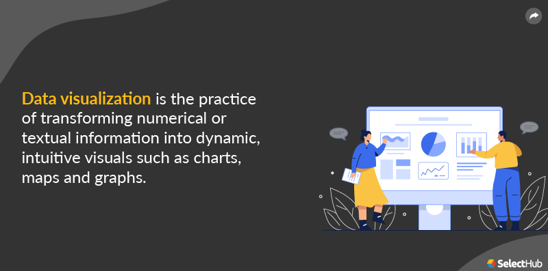
Data visualization is the practice of transforming numerical or textual information into dynamic, intuitive visuals such as charts, maps and graphs. The primary objective of data visualization tools like Tableau, Domo, Oracle Analytics Cloud and Yellowfin BI, is to identify trends, patterns, characteristics, points of interest and outliers in large data sets to make robust business decisions.
A sales and marketing professional creates intuitive data visualizations to unearth data trends or disruptions. A line chart depicts an increase in sales year over year. Scorecards represent monthly KPIs, and color-coding them based on gains and losses gives you a clear picture of business performance.
A content marketer uses a stacked bar chart to gauge which blogs generate traffic and which ones aren’t performing.
Importance
Data visualization helps you identify factors that affect consumer behavior, locate and address specific concerns, simplify data for stakeholders, gauge when and where to place particular products, and predict sales.
It also helps you:
- Absorb information to detect patterns and draw conclusions.
- Make amendments to business processes and boost ROI.
- Identify correlated parameters to make accurate predictions.
- Build powerful dashboards to convey a data story effectively.
- Speed up the decision-making process.
Creating Effective Visualizations
Data visualization is equal parts art and science, and there’s no tried and true way to approach it. You can use different data presentation techniques, but it is essential to follow a logical path to make true sense out of numbers, measurements and facts.
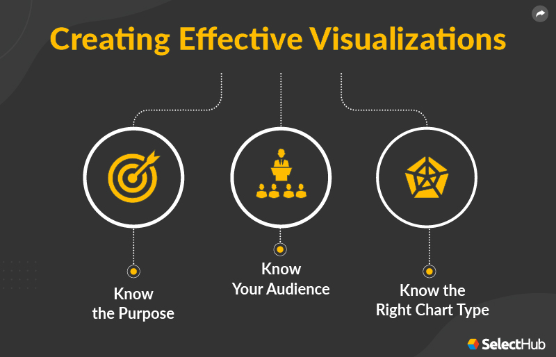
How do you create an effective data visualization? Here are some points to consider:
Know the Purpose
Before you jump into creating a visualization, you need to know its purpose. Generally, we use visualizations to explore information and find key insights, but they can also create awareness about specific findings.
For instance, when a journalist designs visualizations for weather reports, the objective is to create audience awareness. When climate scientists create data visualizations to illustrate their findings, they call for action.
Know Your Audience
If you want your presentation to make a splash, you need to customize it based on your audience’s needs, expertise level and analytical capabilities. Certain factors like cultural preferences and psychological motives also play a crucial role in developing rich visualizations.
For example, in Chinese culture, red represents a positive event, such as an increase in sales in a particular religion. In the West, blue or green depicts positive trends like revenue increases. Similarly, visuals for financial analysts will differ from those targeted at marketing professionals. Customization is key.
Know the Right Chart Type
Choosing the correct chart, graph, map or table ensures that it resonates with your audience. The right chart can empower readers to explore data, find valuable insights and make conscious decisions after evaluating different scenarios.
Visualization Types
There are four basic chart types that you can use to represent information:
Comparison Chart
Displays two variables against each other and portrays their interaction. For example, line charts display an increase or decrease in product sales across various months.
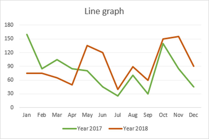
A line chart depicting sales in 2017 and 2018. Source
Composition Chart
Depicts how individual parts make up a whole. For instance, a pie chart shows the market share of automobile companies.

A pie chart showing the market share of automobile companies. Source
Distribution Chart
Helps you understand the range of values in a dataset and identify outliers. A histogram displays the grade distribution of a university exam.

A histogram showing the growth rate of total health expenses per capita. Source
Relationship Chart
Shows correlation between two or more variables. A scatter plot presents the relationship between advertising spend and sales revenue.
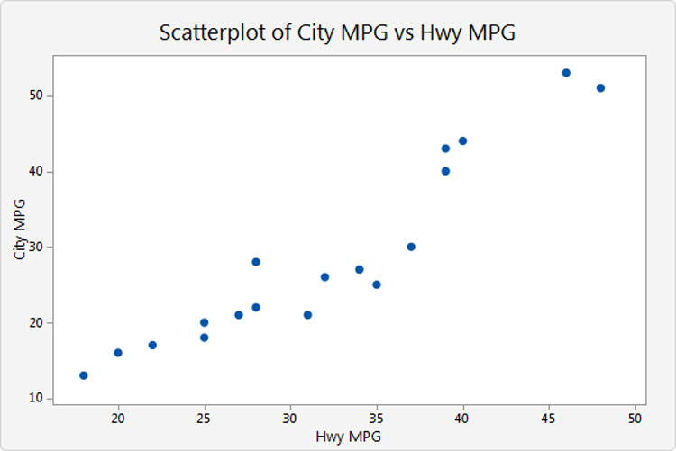
A scatter plot showing city MPG vs. highway MPG. Source
Use Cases
Organizations rely on visualizations and dashboards to obtain high-level insights into business performance. The following are common applications of visualizations:
Sales and Marketing
Sales and marketing departments create visual summaries to track revenue, leads, conversions and more. You can analyze website traffic sources, visualize trends and gauge marketing campaign efforts.
Healthcare
Use data visualizations to monitor operations, clinical performance and patient profiles. You can analyze clinical, administrative and financial data to support costing, resource allocation and better patient care while maintaining quality standards.
Choropleth maps allow you to view how a variable like mortality rate due to heart disease changes across specific regions.
Human Resources
Data visualizations and dashboards play a key role in human resource management. They assist you in measuring employee productivity, turnover rates, cost per hire, training costs, employee retention period and more.
Conclusion
Data visualization is here to stay. It’s imperative to build a robust foundation for analysis and storytelling to explore massive amounts of information, including big data.
Which data visualization tools do you prefer to use? Let us know in the comments below!

Leave a Reply